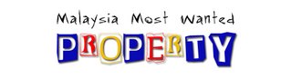
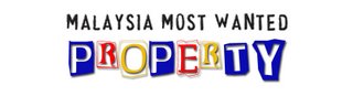
Gathering opinion for logo design is not easy, as every had very different opinions. Thus, I have to be selective and bias towards my preferences, logicality and my tiny bits of design knowledge.
Khim says:
You managed to emphasis the product name but try not emphasis brand name as well, you will make people confuse what "message" you trying to bring out
I agree with her, you can only emphasize on one thing in logo design. Gotto make "Malaysia Most Wanted" simpler.
Mich preferred a one line horizontal design, rather than top and bottom layer. This design is quite technically challenging, as “Malaysia Most Wanted Property” is a pretty long phrase.
MasterMind prefers less variation is size and colour, but I like the catchiness of “Property”.
Mei Ru said “Malaysia Most Wanted” font look a bit “playful”. I kinda agree with her, as I want “Property” to be lively and colourful but “Malaysia Most Wanted” to be more "classic" with personality.
Tang wants to focus on brand name rather than product time. This could be true, but perhaps not for my case. At this moment, “Malaysia Most Wanted” brand had no value, and it doesn’t reflect the functionality of the site (nor I have the budget to market the brand name). “Property” on the other hand is our current main service and should be emphasised. At least to let people know what am I offering them.
I had made some changes to the design. “Malaysia Most Wanted” and “Property” shall be of the same width, to have a more box solid feel. The design of “Property” shall remain unchanged.
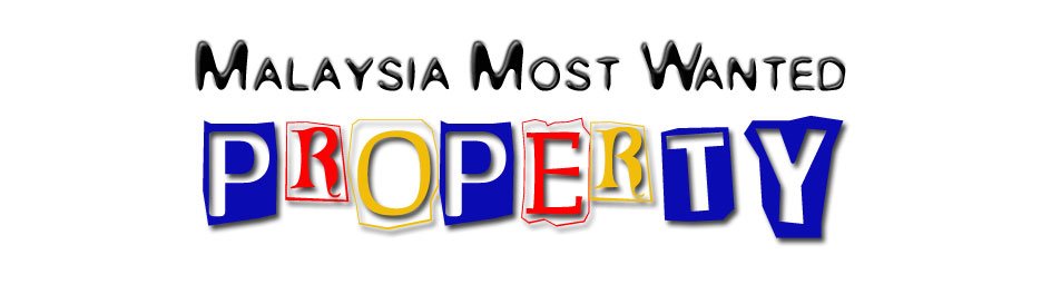
This is quite a normal and safe font, yet round and kinda cute. I shall use Black Colour as it is classic. I shall not used shades or multiple colour, as “Malaysia Most Wanted” shall be simple and “Property” should be catchy. Pillow Emboss effect is used to create an “On the Ground” effect.
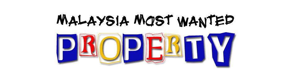
This is a simple design with attitude, no shades and no effect. It seems slim and wild.
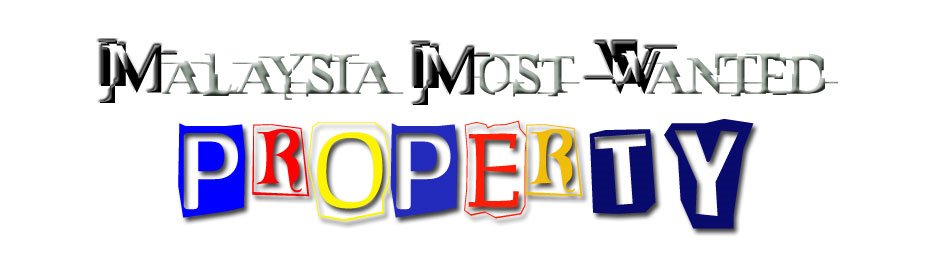
This is dark brown with Emboss effect to make it stand out. It is solid with character.

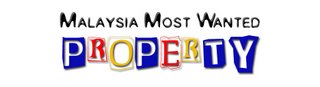
This is another plain vanilla black with no effect, and the font by itself is strong enough. It kinda gives the feelings of creativity and strength.
These designs seem to be a combination of simplicity and liveliness. Which one do you like?