
This is initial Logo for MMW Property. Malaysia Most Wanted (MMW) is the brand name, while Property is the product name. This design is simple and clear, but perhaps a bit too dull.
After 3 months into development, I believe it is time to design to a catchier logo. Thus came the classic Malaysia Most Wanted theme coupled with the colourful Property (inspired by Google style), and Mei Ru helps me to pick up the fonts. Kenny mentioned that MMW’s font seems a bit Matrix look alike, and I kinda agreed. He claims the entire design is too messy, which might be true. Wynn also commented the classic black and white MMW does not match the colourful Property. The reason for this is to create a sense of visual separation of the brand name from the product name. Making them same themed or almost same colour seems kinda messy, any good suggestion?

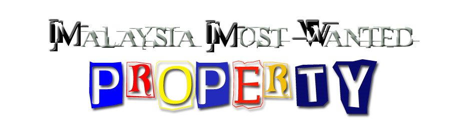
After some discussion with Kenny, I decide to shrink MMW and use a less complex font. I reduce the colour of Property to 3 colours only (the previous design had 3 colours too, but with a slight variation).
I am still not quite satisfied with this. Any more idea?
11 comments:
I would prefer the "PROPERTY" to not have so much variation in character size and color.
The text of the last logo looks clearer, but both font looks a bit "playful", something like "Toy R Us"..
Keep all the font and colour same for the whole thing(Malaysia Most Wanted PROPERTY)-> follow Malaysia Most Wanted font but with bigger size.
The MMW should be outstanding instead of the word PROPERTY. So, apply the 3 colours currently in PROPERTY into MMW(this 3 magic characters can be abit playful like PROPERTY FONT).
Branding... this makes ppl remember your MMW instead of concentrate on playful property. Just my opinion.. Cheers..
Property use one colour different from(maybe in purple) the (M)alaysia (M)ost (W)anted
So next time got new product use another colour. one product one colour..got 7 product mai use all raibow colour lur... heheh :D
Hey everyone! Our company https://rankmywriter.com/essay4less-com-review offer you to order an annotated bibliography executing from our service where only highly qualified authors are hired to help students present their academic researches decently.
Malaysia Most Wanted presents a gripping narrative of pursuit and intrigue, blending crime and drama seamlessly. For those who enjoy a twist of humor alongside action, check out Funny Shooter 2 , where you’ll experience the thrill of virtual escapades mixed with hilarious gameplay.
I mean, a uniform color scheme could be cool, but then again, why not add some snow? You can feel the chill while checking out Snow Rider 3D for some sledding action!
Totally with you on the font sizes—it's like they threw a font party! Instead of a real sniper duel, how about some fun with Rooftop Snipers instead?
The playful vibe of those logos kinda screams 'buy me!' but I'd still rather inject some laughter with Funny Shooter 2 while debating aesthetics!
Man, branding can be such a headache, right? But, hey, speaking of playful graphics, you should check out Football Bros for some awesome football fun!
All those colorful ideas have me thinking—branding is just like a good anime: needs depth and a dash of excitement! Speaking of fun, check out <a href="https://iwanttoloveyoutillyourdyingday.com/>I Want to Love You Till Your Dying Day</a>!
Post a Comment