Khim says:
You managed to emphasis the product name but try not emphasis brand name as well, you will make people confuse what "message" you trying to bring out
I agree with her, you can only emphasize on one thing in logo design. Gotto make "Malaysia Most Wanted" simpler.
Mich preferred a one line horizontal design, rather than top and bottom layer. This design is quite technically challenging, as “Malaysia Most Wanted Property” is a pretty long phrase.
MasterMind prefers less variation is size and colour, but I like the catchiness of “Property”.
Mei Ru said “Malaysia Most Wanted” font look a bit “playful”. I kinda agree with her, as I want “Property” to be lively and colourful but “Malaysia Most Wanted” to be more "classic" with personality.
Tang wants to focus on brand name rather than product time. This could be true, but perhaps not for my case. At this moment, “Malaysia Most Wanted” brand had no value, and it doesn’t reflect the functionality of the site (nor I have the budget to market the brand name). “Property” on the other hand is our current main service and should be emphasised. At least to let people know what am I offering them.
I had made some changes to the design. “Malaysia Most Wanted” and “Property” shall be of the same width, to have a more box solid feel. The design of “Property” shall remain unchanged.
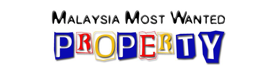
This is quite a normal and safe font, yet round and kinda cute. I shall use Black Colour as it is classic. I shall not used shades or multiple colour, as “Malaysia Most Wanted” shall be simple and “Property” should be catchy. Pillow Emboss effect is used to create an “On the Ground” effect.
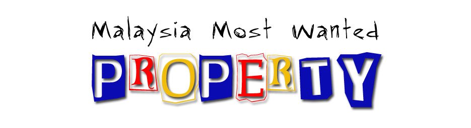
This is a simple design with attitude, no shades and no effect. It seems slim and wild.

This is dark brown with Emboss effect to make it stand out. It is solid with character.
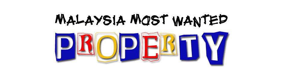
This is another plain vanilla black with no effect, and the font by itself is strong enough. It kinda gives the feelings of creativity and strength.
These designs seem to be a combination of simplicity and liveliness. Which one do you like?
9 comments:
I prefer the 1st logo, as it's clean n clear. The char M-M-W is a bit bigger, so it's good as you always mention the short name MMW.
2nd logo - pencil color written words, look more like for kids
3rd logo - when I first look at the logo, got "blur blur" feel. mong cha cha, ngan fa fa.. so, it's out.
4th logo - this 1 quite good also, but looks a bit messy as compared to 1st 1.
conclusion, i vote 4 1st logo :)
i vote for the first logo.
Clean, clear and direct.
I prefer 2nd design coz i like the font so much..khim
the 2nd one is better. The more simplier, the much better.
IMHO, the 'PROPERTY' fonts still look weird. Too kindergarten-ish for a a site on real estate.
If i have to choose, it will have to be the first logo, only because the fonts for 'Malaysia Most Wanted' is neater and not so indistinguishable.
By rule of thumb, brand name should appear smaller than the product name but since the whole site is called 'Malaysia Most Wanted Properties', I suppose it flows as one single sentence.
Also, shouldn't it grammatically be "Malaysia's Most Wanted" ?
eg. America's Next Top Model, FBI's Most Wanted list....etc.
About the grammar, "Malaysia's Most Wanted" may cause confusion for the url name, thus "s" is dropped.
In fact, Google's and Yahoo's logo looks childish as well. Frankly, I am not quite into the mantra of professionalism (a.k.a boring). I prefer something lively and catchy. The "Property"'s font is actually made of newspaper cuttings. I might consider looking into other fonts, but I still want it to be a fun font.
Though real estate is a serious business, but I don't want to create a boring (follow the herd) portal. It is supposed to be different and unique, thus what better way to start that than creating a out of conventional logo.
For most Yahoo/Google offerings, the brand name is larger than product name. But for my case, "Property" (product name) is larger and be the center of attention as it serve a purpose, and the public is still unaware of what MMW is.
Frankly, I like all the designs for different reasons. Perhaps I should think further on what am I trying to potray :)
Players are able to effortlessly perform intricate plays thanks to the controls in basketball stars, which are intuitive and responsive. Thanks to its user-friendliness, gamers of all skill levels can enjoy it.
Take advantage of the Mapquest Directions local services integration to discover new restaurants, attractions, or fuel stations along your route.
The blog post provides an insightful journey into logo design, balancing aesthetics, functionality, and brand identity. The detailed feedback showcases thoughtful consideration of design elements. For more creative inspirations and ideas, visit Tap Drift – your gateway to innovative solutions!
Post a Comment